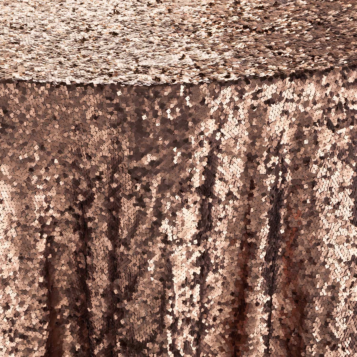
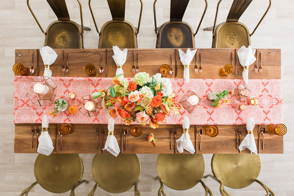
Our September Color Crush is a full palette of colors that welcome fall with their comforting qualities. We love the combination of Crabapple, Grapeade, Rocky Road and Peach Pink. Crabapple and Grapeade are both featured in Pantone’s London Fashion Color Report. Rocky Road and Peach Pink complete the palette adding a great foundation and highlight.
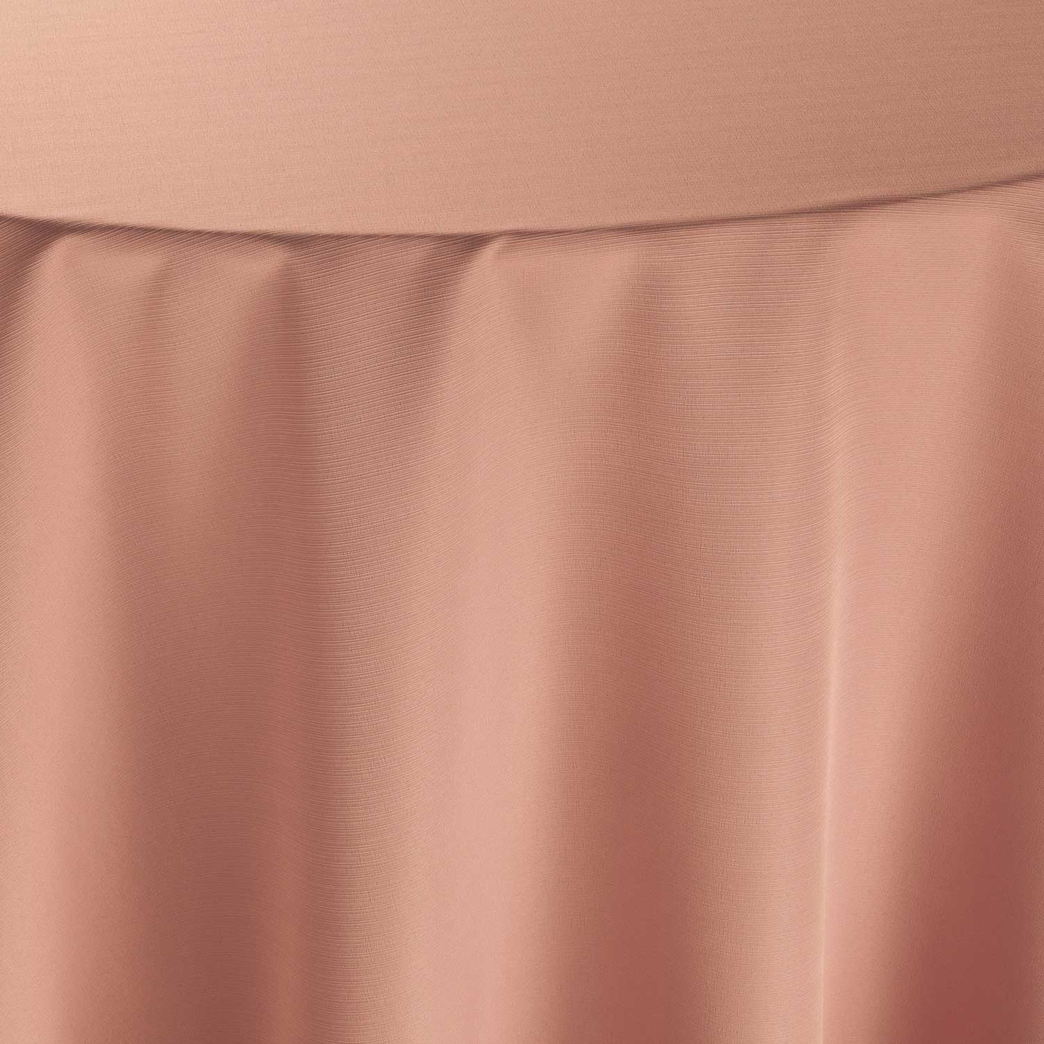
Crabapple
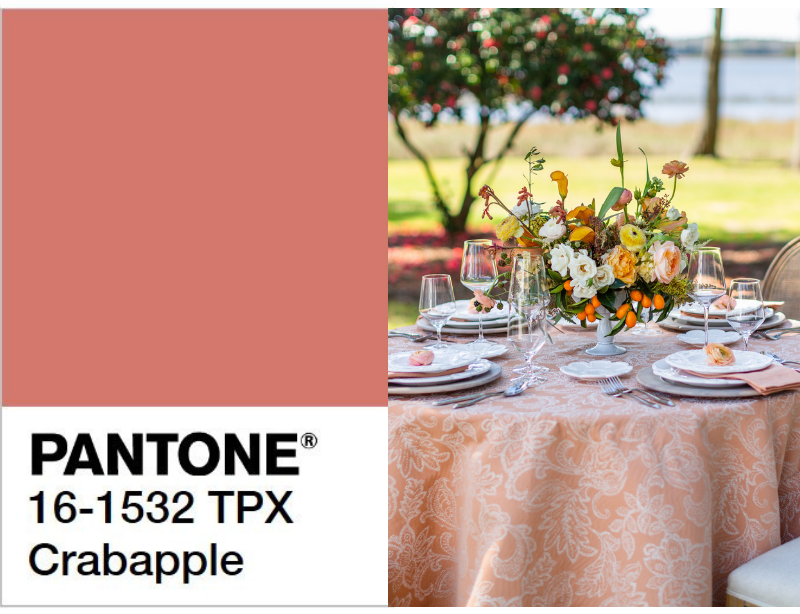
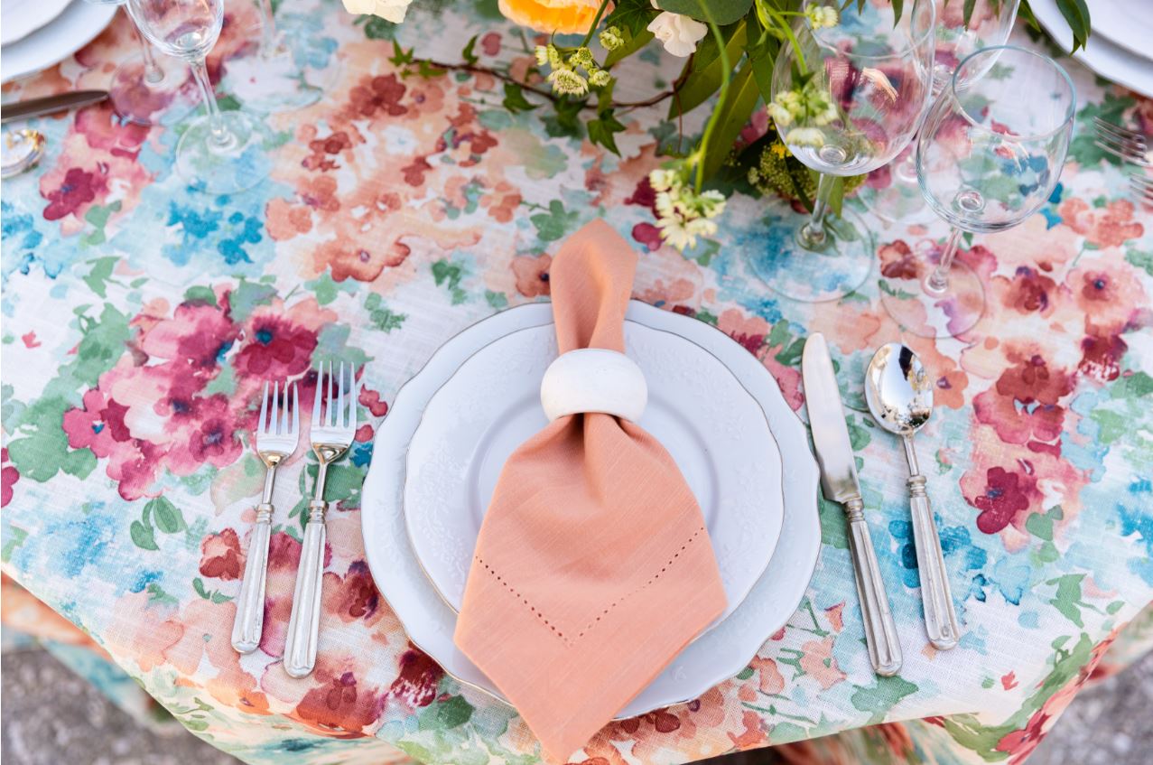
pantone.com | Designer: Madcap Cottage, Photography: Theo Milo Photography, Floral: Out of the Garden | Linen: Persimmon Courtyard
An endearing shade of rose with a tinge of orange throughout, Crabapple brings warmth and coziness that comes with fall. This shade can closely be associated with Salmon and is considered a color of health and happiness. As a nod to the waning summer months, Crabapple evokes confidence and is the perfect color to begin the palette.
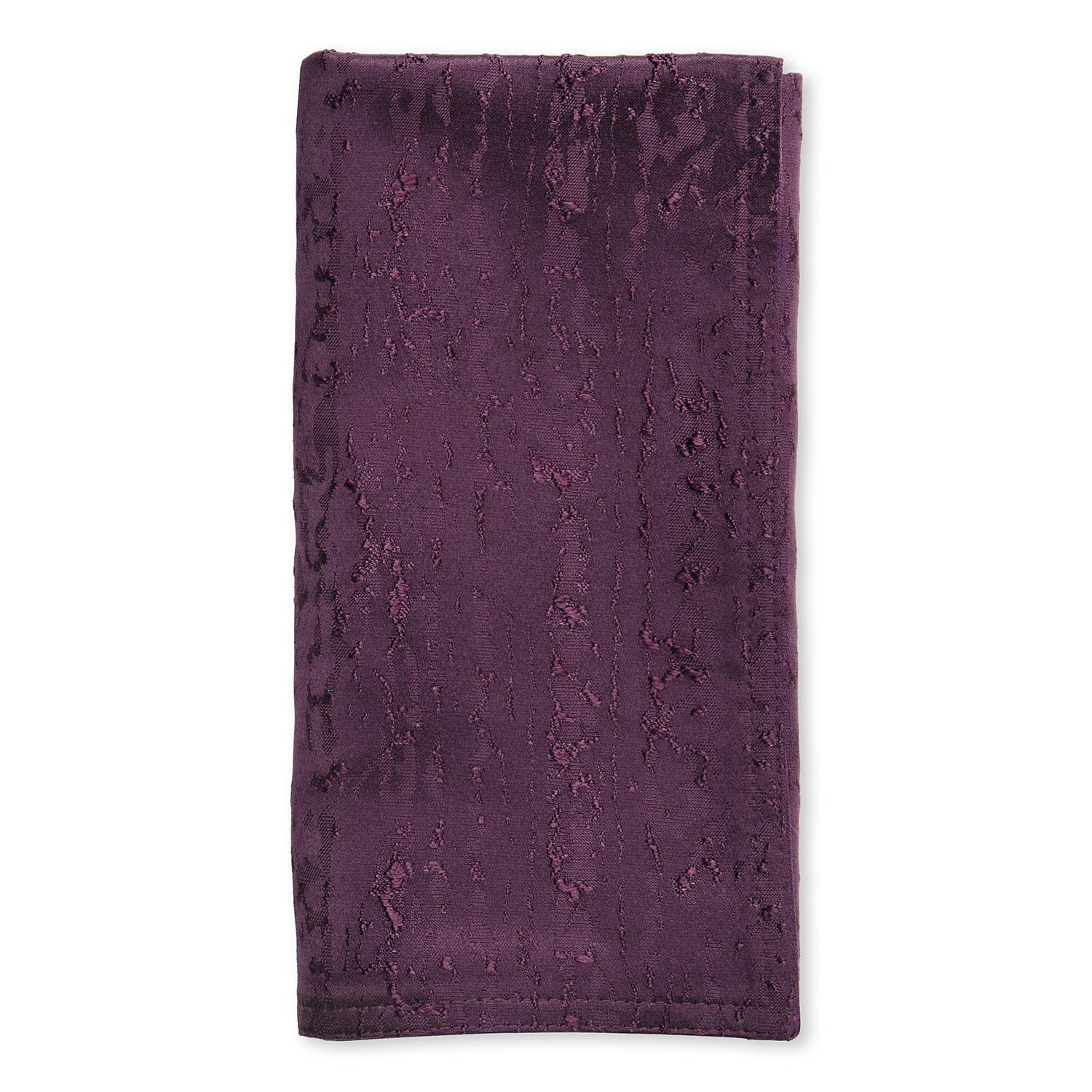
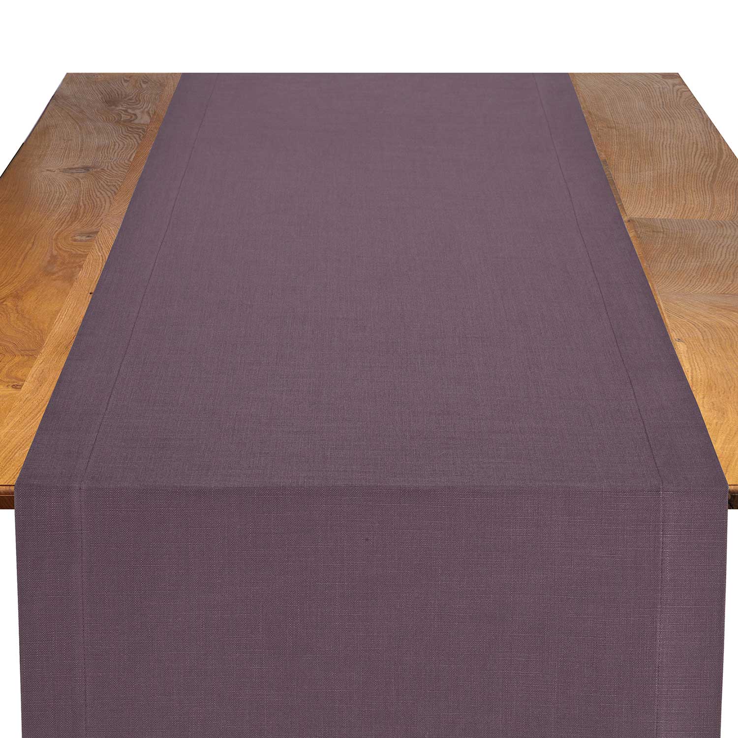
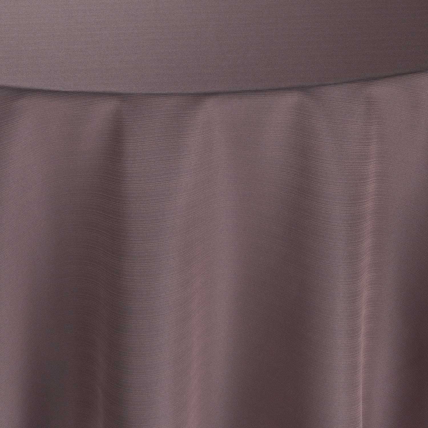
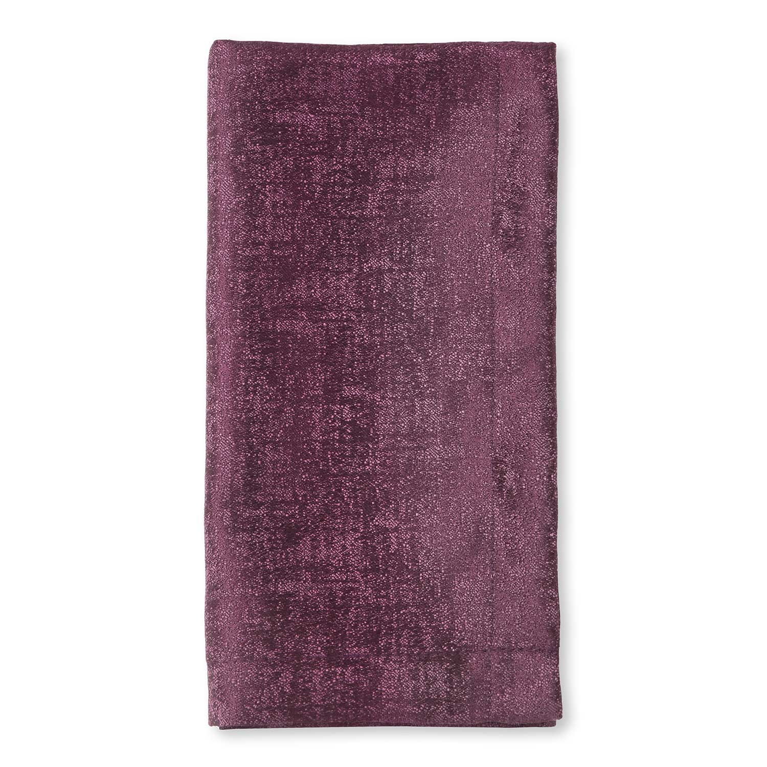
Grapeade
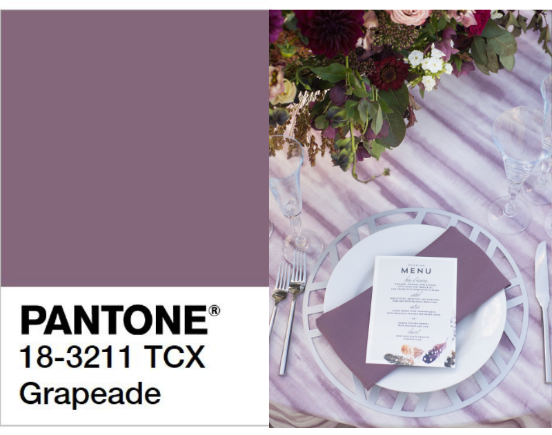
pantone.com | Photography: Cameron Clark, Floral: The Wildflower AZ, Venue: El Chorro | Linen: Dusk Drift
Purple is a royal color often associated with nobility, power and ambition. Mauve shades of purple, like Grapeade, have historically been a symbol of refinement and wealth. Grapeade’s distinctive muted tone pairs wonderfully with Earth tones such as brown and tan.
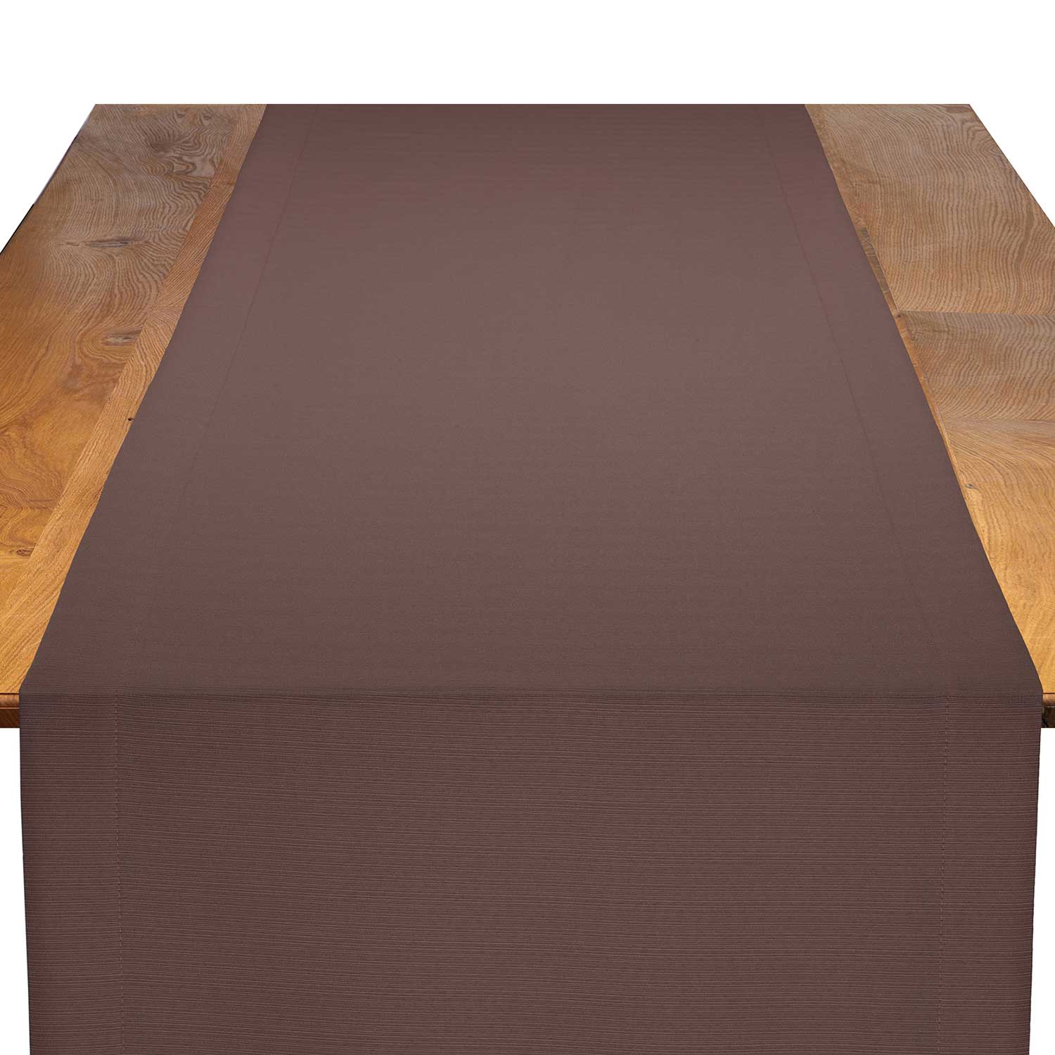
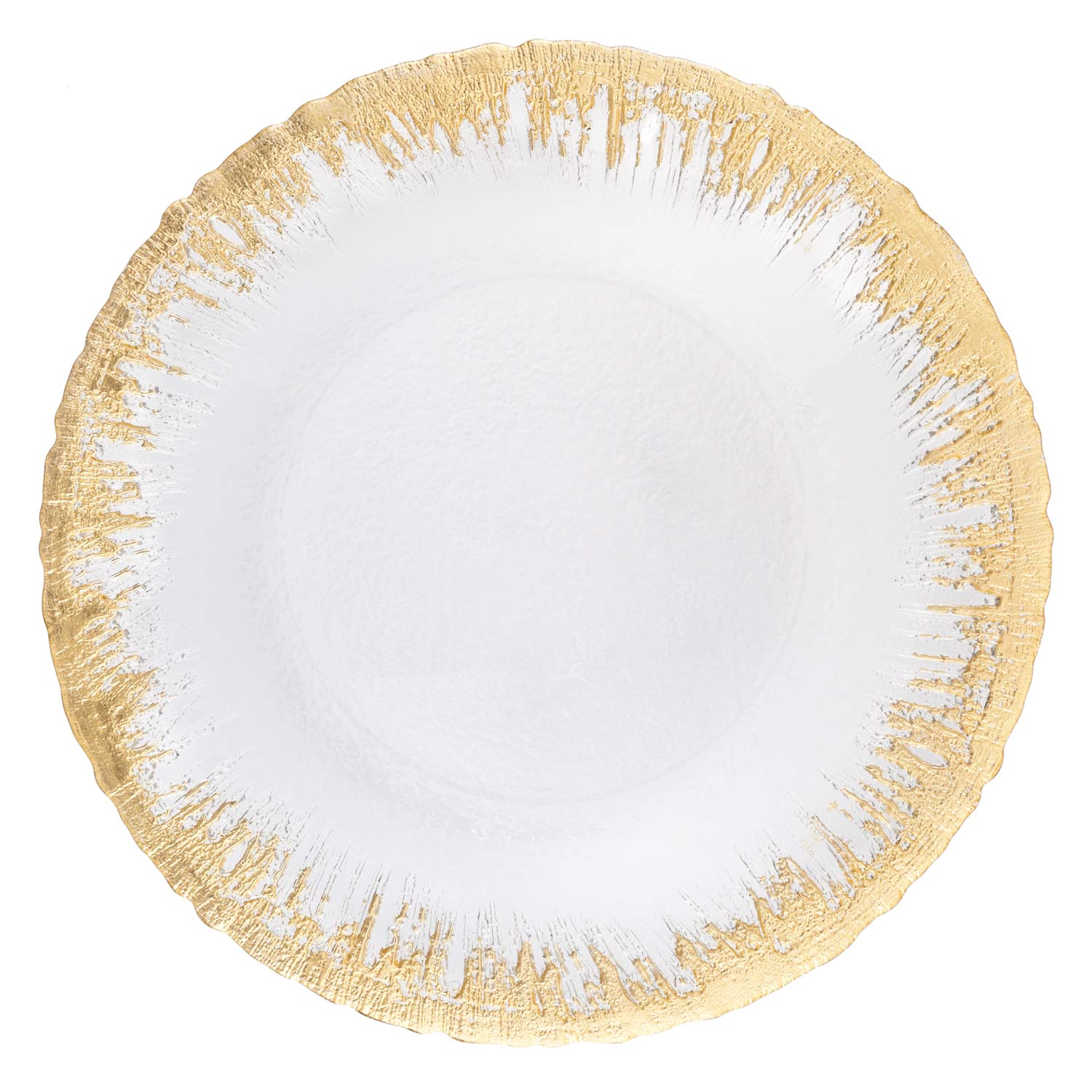
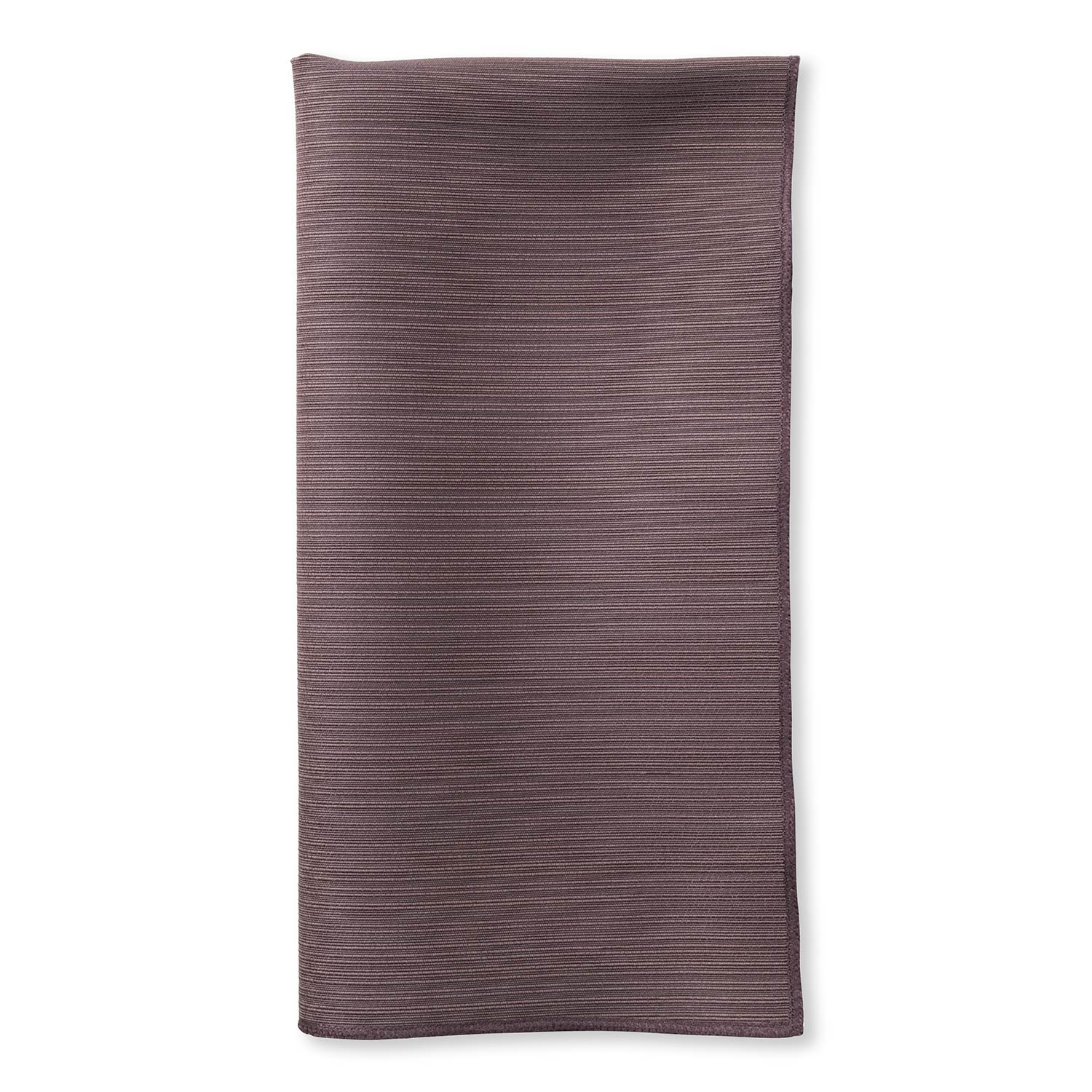
Rocky Road
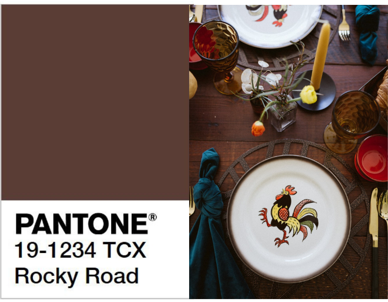
pantone.com | Photography: Lisa Kathan Photography, Stylist: Ellie Styled, Venue: The Barn at Wagon Wheel Farm Floral: Floral Alchemy | Placemat: Bronze Edge Metal Placemat, Napkin: Mallard Velvet Napkin
Rocky Road embodies fall with its natural and grounded feel. Brown is the color of foundations, warmth, and healing and is typically associated with autumn and winter. Rocky Road brings a rich and natural element to the color palette.
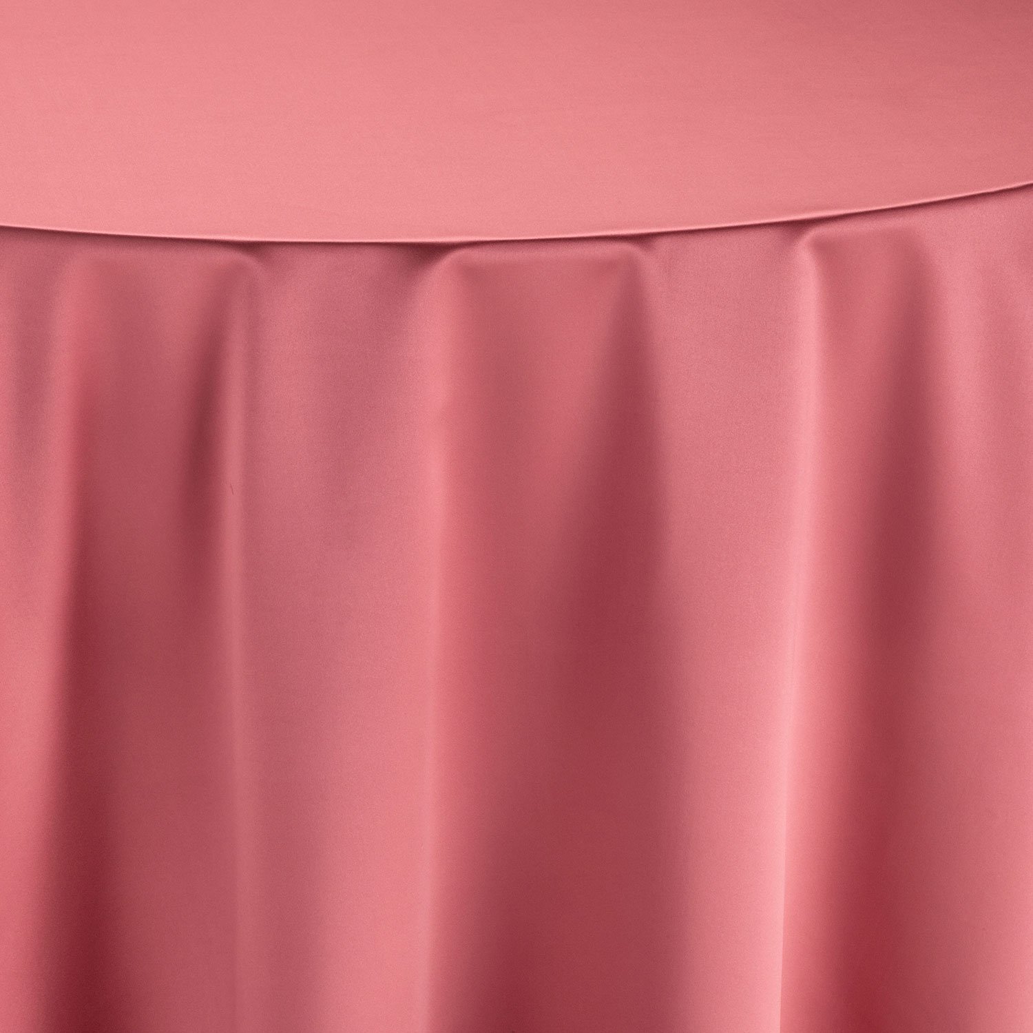
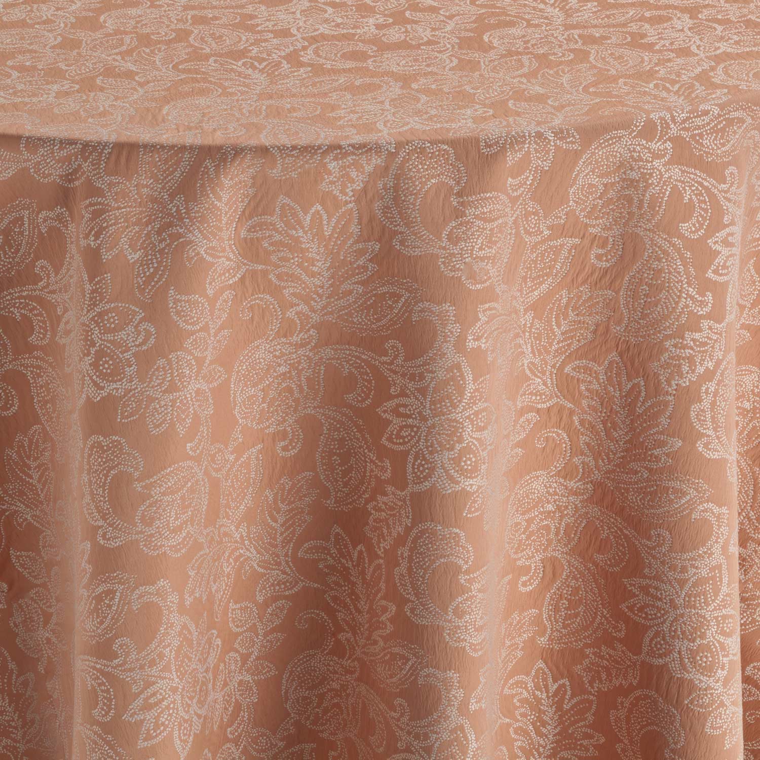
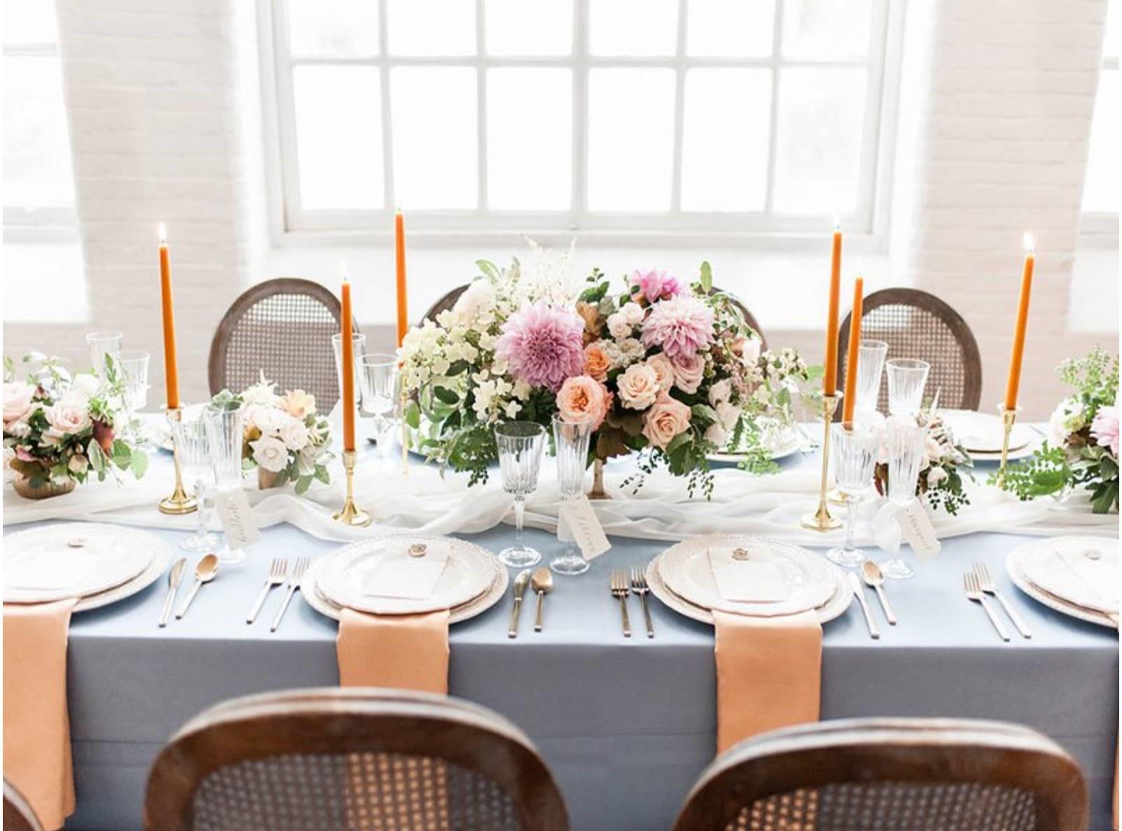
Peach Pink
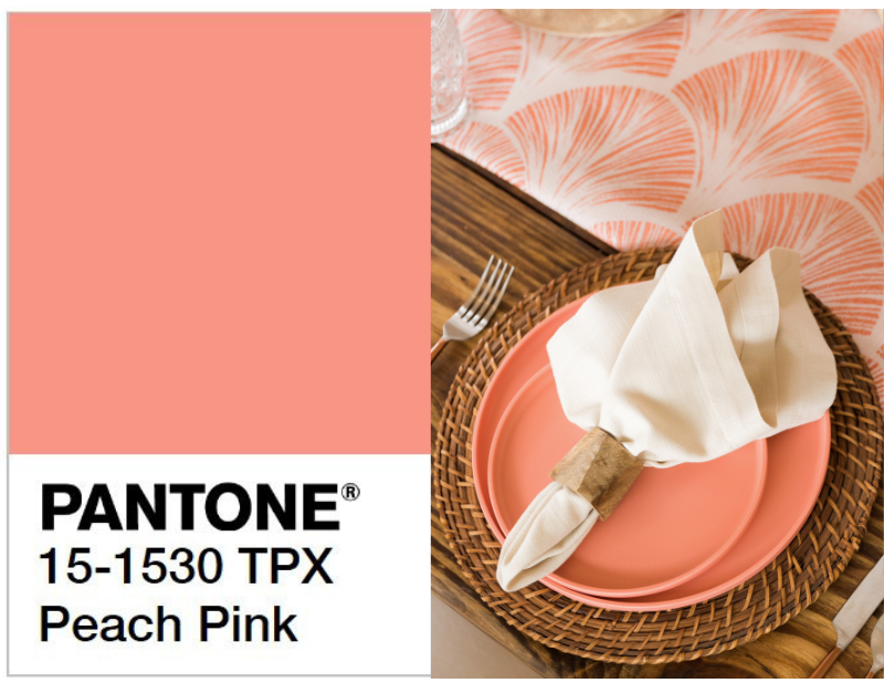
pantone.com | Design: Carillon Weddings, Photography: Aislinn Kate Photography, Floral: Florals by Sea | Table runner: Coral Navarre
Cheerful and flattering, Peach Pink carries a healthy glow to this color palette. Named after the fruit, Peach Pink is more red than plain peach, more yellow than coral pink and stronger than dusty pink. Peach Pink provides a sense of charm, softness and peace.
Mood
Designer: Madcap Cottage, Photography: Theo Milo Photography, Floral: Out of the Garden | Napkin: Permisson Hemstitch Dinner Napkin, Linen: Persimmon Courtyard
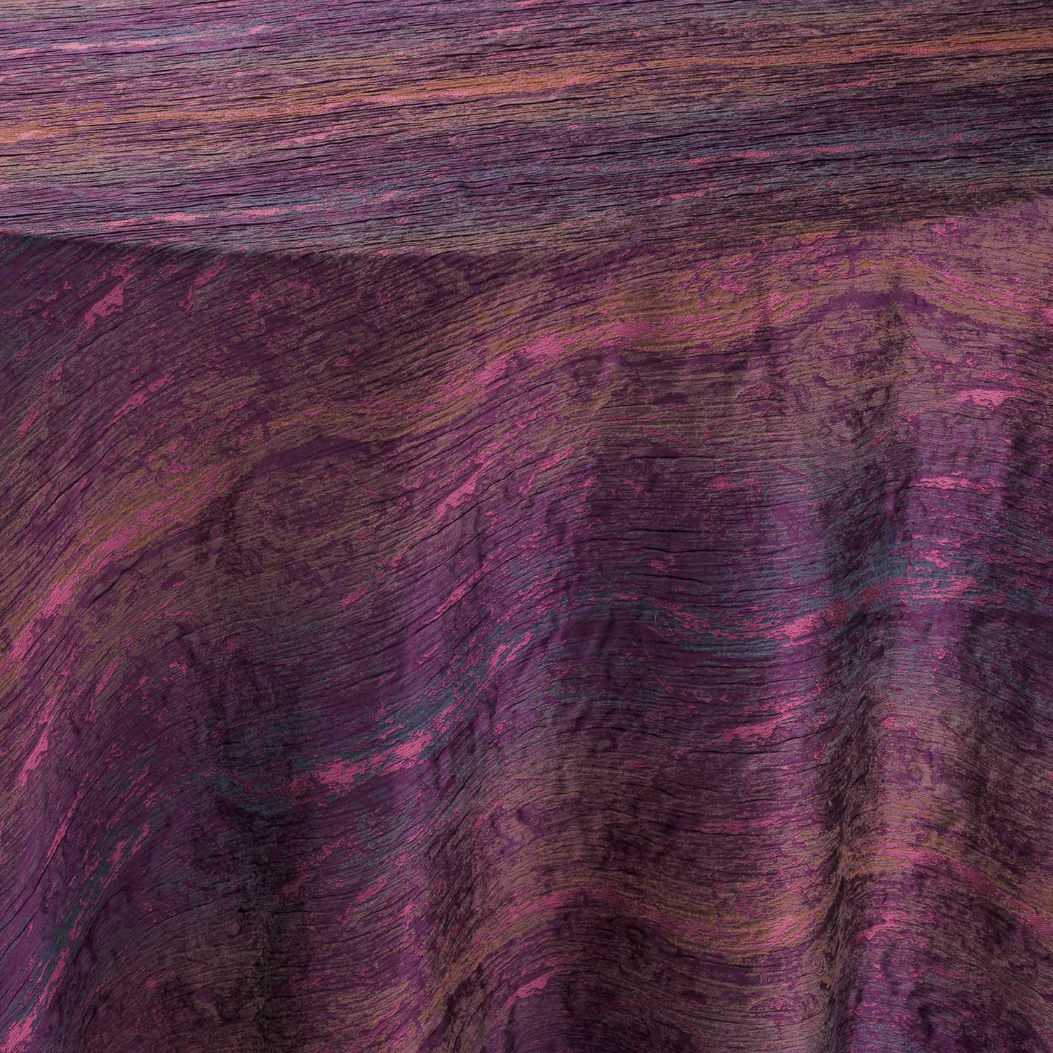
Our Color Crush palette embodies the essence of warm and natural looks. Mixing Earth tones and stunning color combinations creates a sense of well-being and comfort moving into the new season. Each color plays on the other through varying shades. Rocky Road creates a great base to then add in Grapeade and Crabapple through their similar muted tones. Peach Pink then adds the highlight to top off the palette. Each color can stand on its own while complimenting another shade at the same time. Rocky Road can be paired nicely with Crabapple or Peach Pink because both colors have slight orange undertones. Grapeade and Rocky Road also pair nicely to create an autumn feel. All together these colors create a wonderful, natural medley to use.
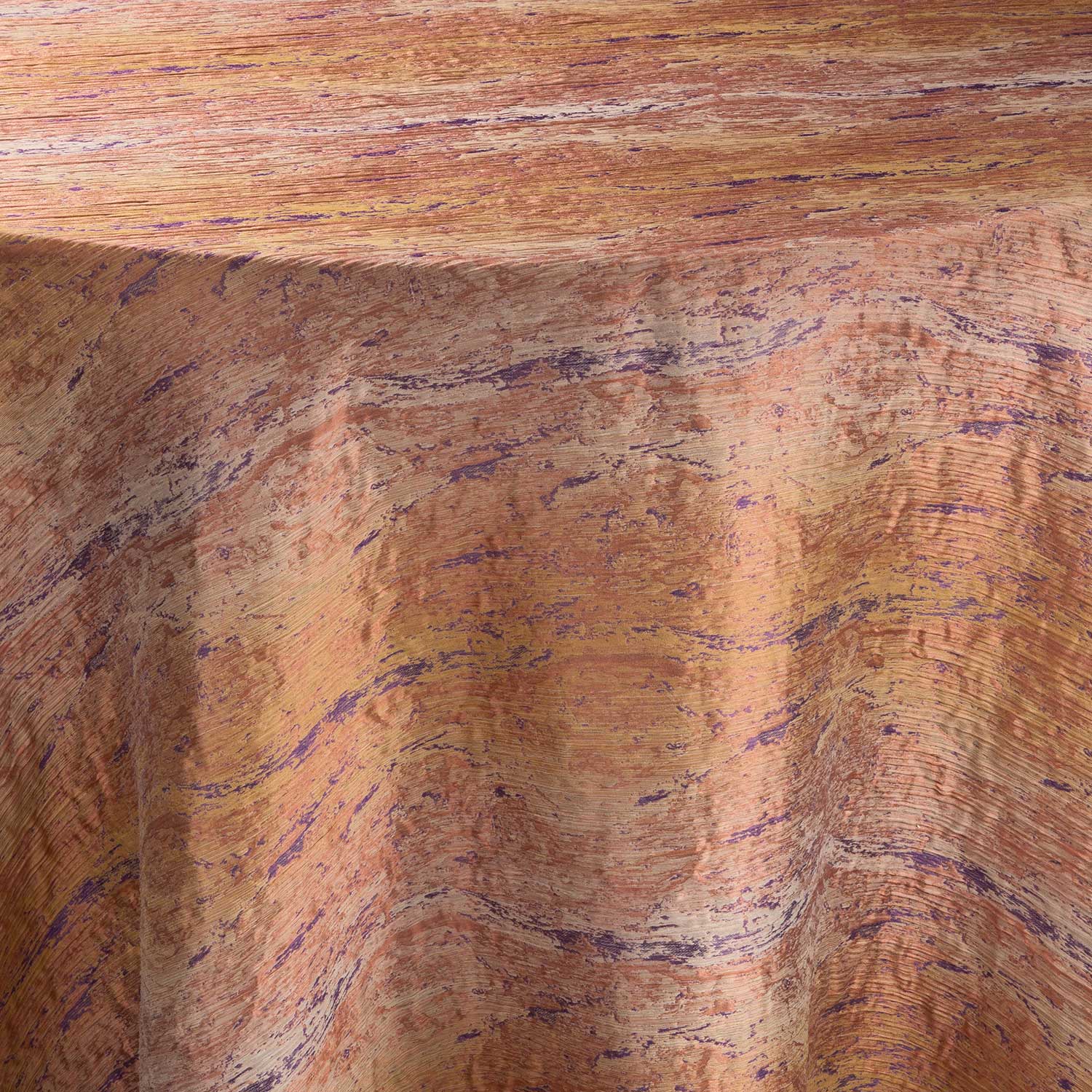
In Nature
http://tomstansfield.co.uk/new-horizon
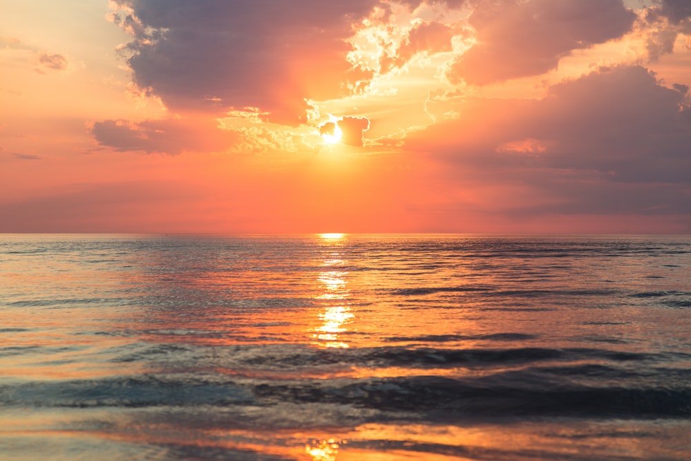
This color palette can be found in beautiful scenes in nature. Because these colors have Earth-tone qualities, they occur together in the world around us. The most prominent example of this palette is in a sunset. The mix of peach and purple hues come out to play in the shadows created as the sun sets every day. This palette can also be found in gardens and floral arrangements.
Interior Design
Top Interior Design Trends
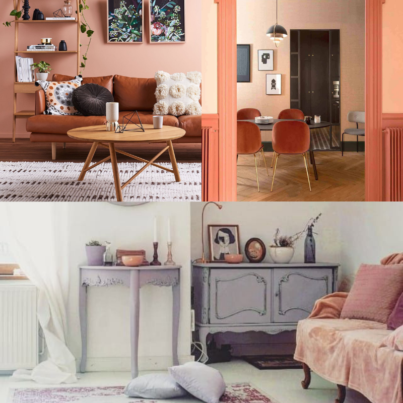
Individually, each of these colors create lovely interior design aesthetics. Grapeade is the perfect color for an interior design that seeks a more subtle purple shade. Brown is an easygoing color that can bring a wholesome feeling as well as a sense of orderliness. Crabapple and Peach Pink are commonly used for home accents because they are less intense shades of pink. When combined, this palette is wonderful for home décor because of its comfortable qualities. This palette works well in living room and bedroom designs to produce a relaxed and cozy feel.
Fashion
Glowsly Fall/Winter Color Trends | Glowsly Fall/Winter Shoe Trends| Fashion United News | Dries Van Noten Winter Fashion | Vogue Fashion Shows Spring 2019
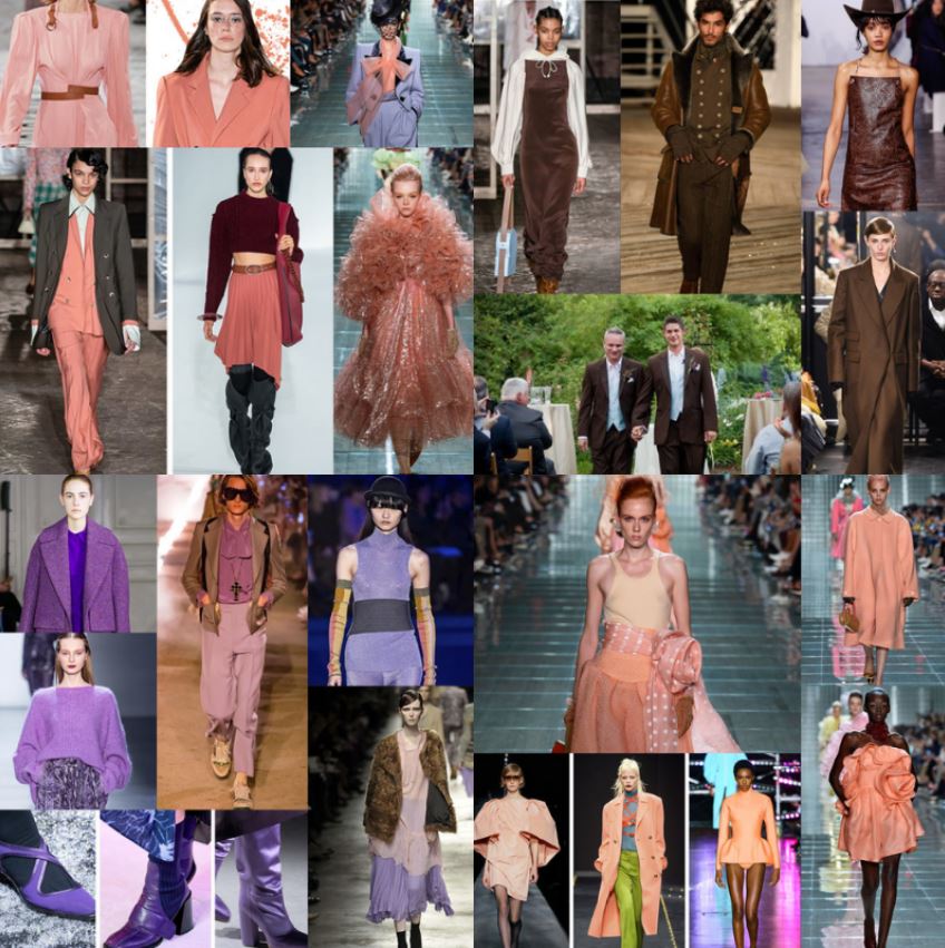
Fashion designers have also incorporated these colors in their fall designs. Crabapple, a seemingly unusual choice on its own for fall, was a popular choice for designers like Dolce & Gabbana on the catwalk. However, when paired with other neutral tones, this somewhat feminine color is lovely for fall outfits. Peach Pink is the more muted version of Pantone’s 2019 color of the year, Living Coral. This color stood out on one of Versace’s creations, a long overcoat with gold button detail. Grapeade can be used as a gender-neutral shade because of its very muted nature. This color appeared to show off its versatility by accenting neutral colors like tan as well as more vibrant blues and yellows. Models also strutted down the runway in full Rocky Road ensembles. Designers love the rich color as a grounded neutral this season.
Beauty
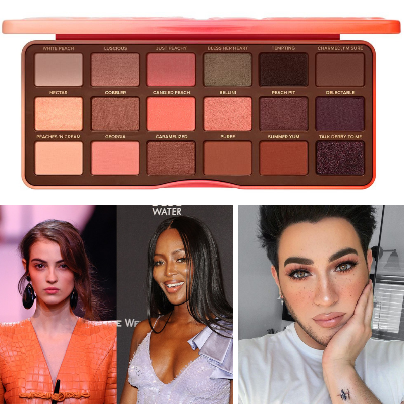
Cosmopolitan UK | Allure | Manny MUA Instagram
This color combination is often used in the beauty industry. Since these colors have a very warm and sincere quality, they are used in several makeup palettes to create a natural look. For example, Cosmopolitan features the Too Face Sweet Peach Eyeshadow Palette as one of the twelve best for different skin tones. This palette features all the colors in our Color Crush palette. These colors may also be used to feature different areas of the face. Rocky Road could be used to contour the cheeks to create shadow and Peach Pink may be used to highlight the eyes.
Crabapple, Grapeade, Rocky Road and Peach Pink combine to make a gorgeous color palette heading into the new season. These inviting colors create a sense of comfort and ease. Tag @BBJLinen on Instagram to show us how you’ll use our September Color Crush. We can’t wait to see how you’ll use these colors together. For more of our Color Crushes, check out our previous Color Crush blogs!
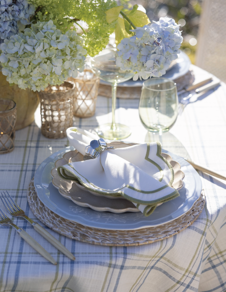
Shop this look