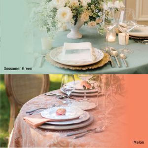
It’s officially time to start thinking about all things spring! Moving away from the drab, darker colors of winter, we are giving bright, blissful colors all of our attention. With great anticipation for all the colors in store for 2020, we are excited to introduce this month’s color crush pairing of Gossamer Green and Melon.
Contrasting saturation and intensities, make these two colors the perfect springtime palette. Delicate enough for spring yet equally animated to capture the vibrancy of summer. Whether using these colors to spruce up a neutral space or playing with the combination, using these two colors in your event design is easier than you think. Learn more about uses for these refreshing colors below.
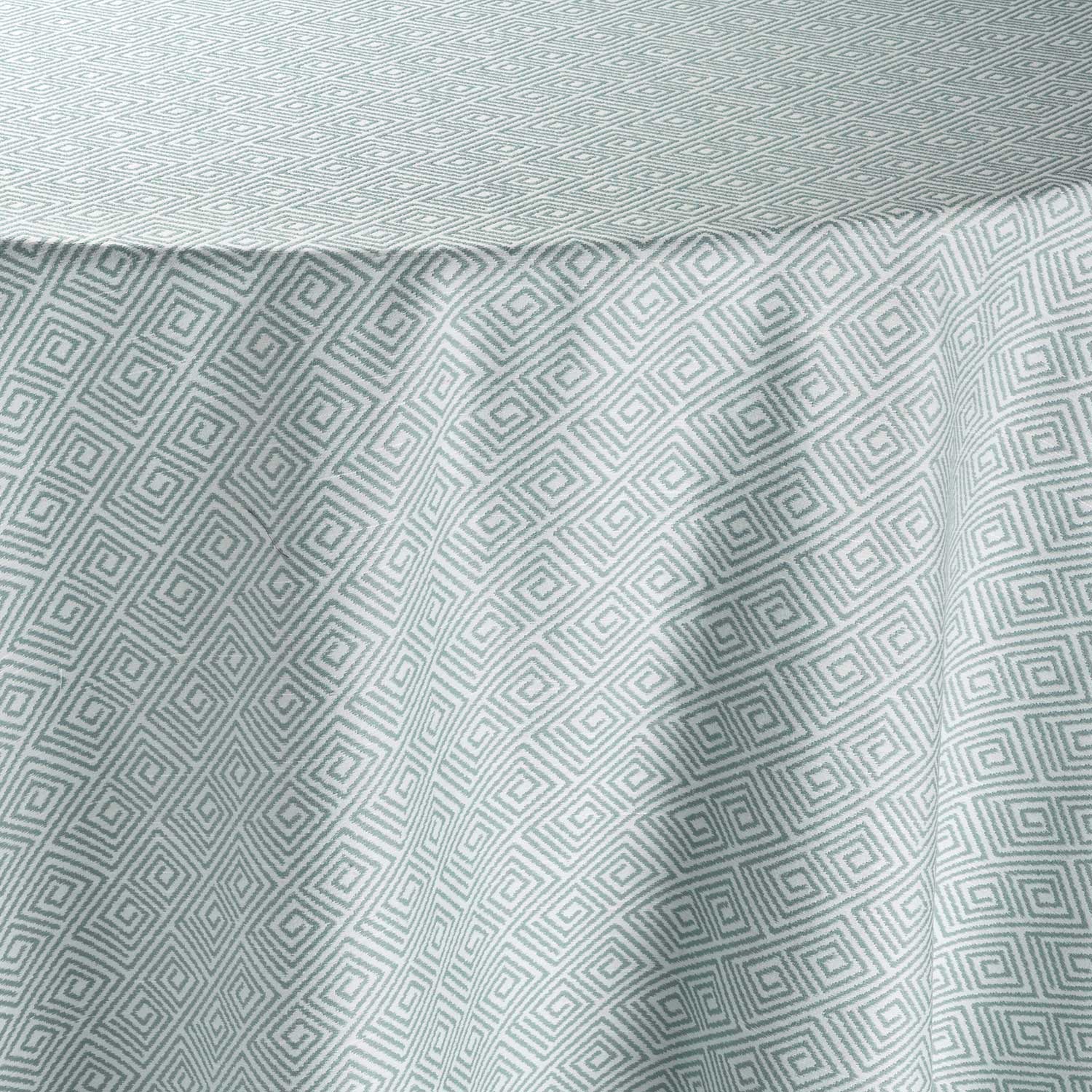
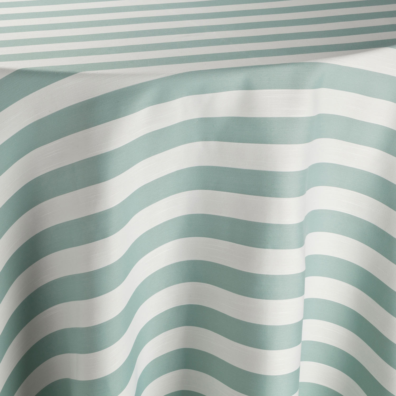
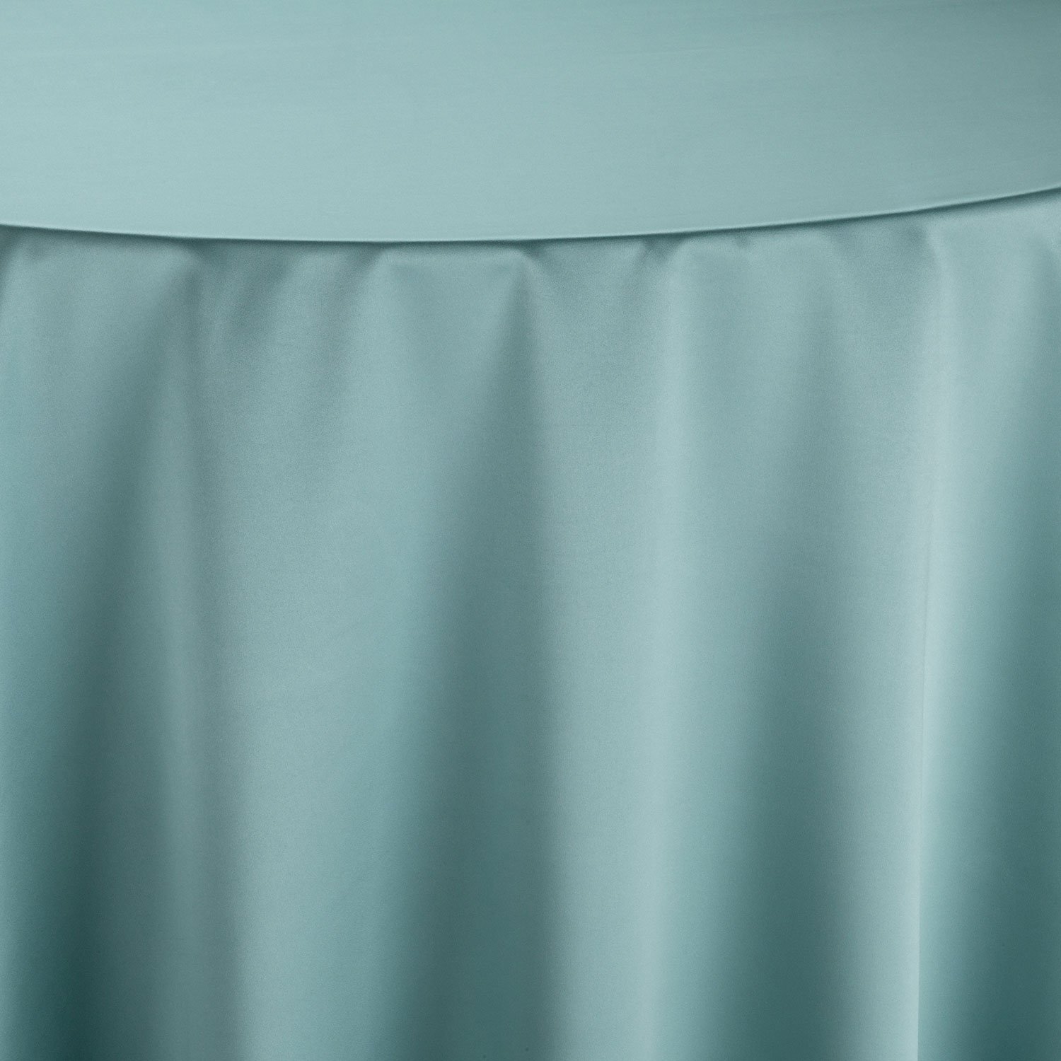
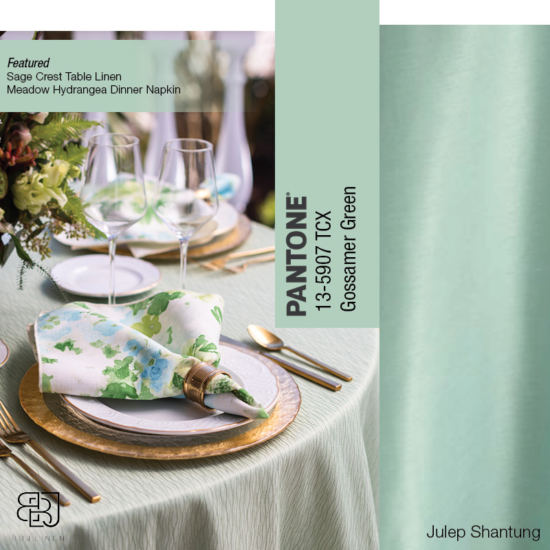
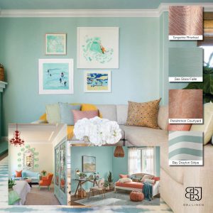
Gossamer Green
 Madcap Cottage | Theo Milo Photography | Curtis Kennedy Films | Out Of The Garden | Ohh! Events
Gossamer Green is a soft, shaded, green-cyan that combines the tranquility and serenity of blue with the sensation of renewal and growth of green. This serene hue draws attention but in a particularly calm way. Making it the perfect choice for conveying spring and all the newness of the season.
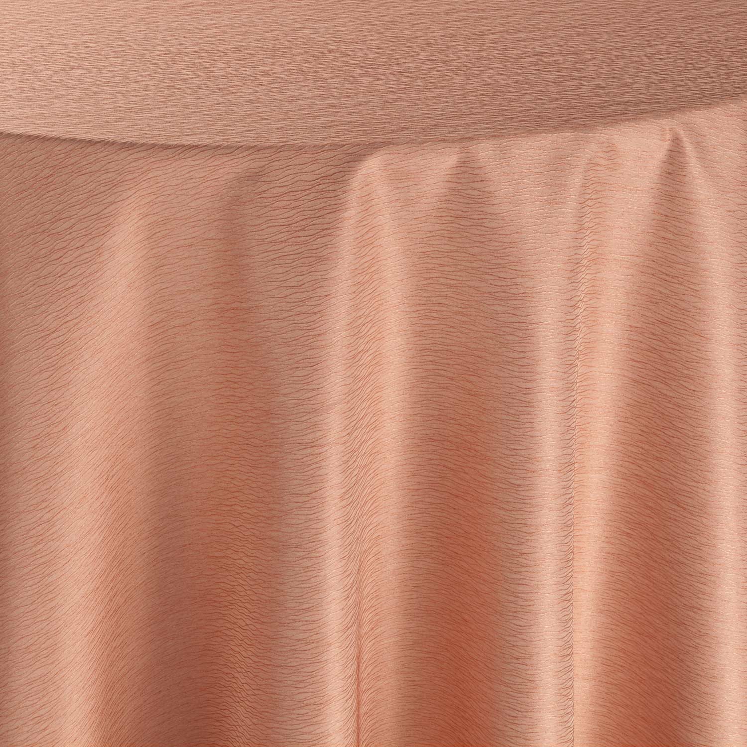
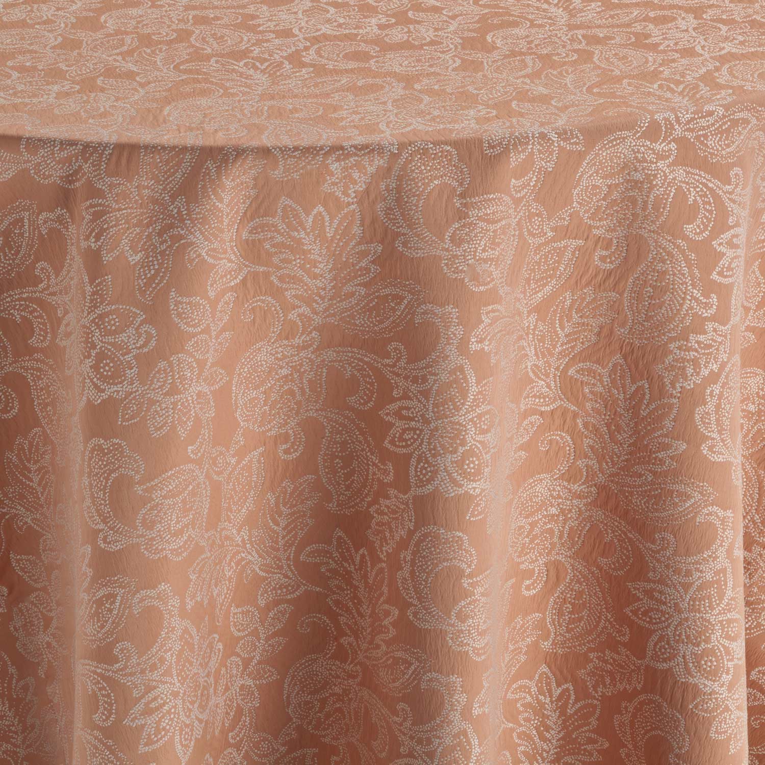
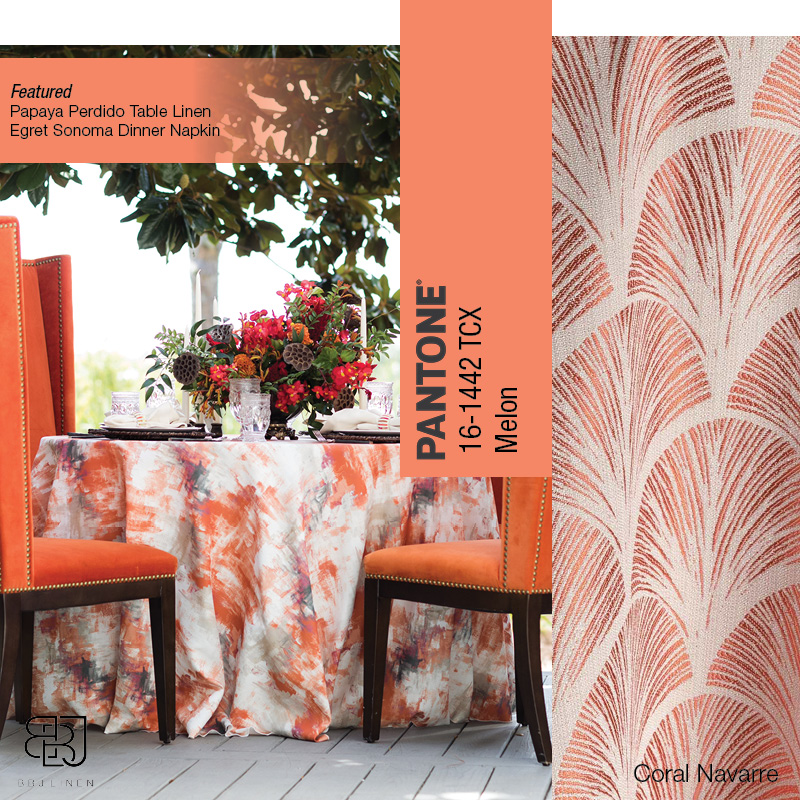
Melon
Aislinn Kate Photography| Florals by the Sea | Carillon Weddings
A lively invigorating light-medium shade of red-orange, Melon is a zesty hue full of freshness and vigor. This tone is a crisp, energizing color that evokes thoughts of summer fruits and leisurely, laid-back, warm evenings. Considered friendly and inviting, Melon demands notice without being as overpowering as some of its neighboring colors.
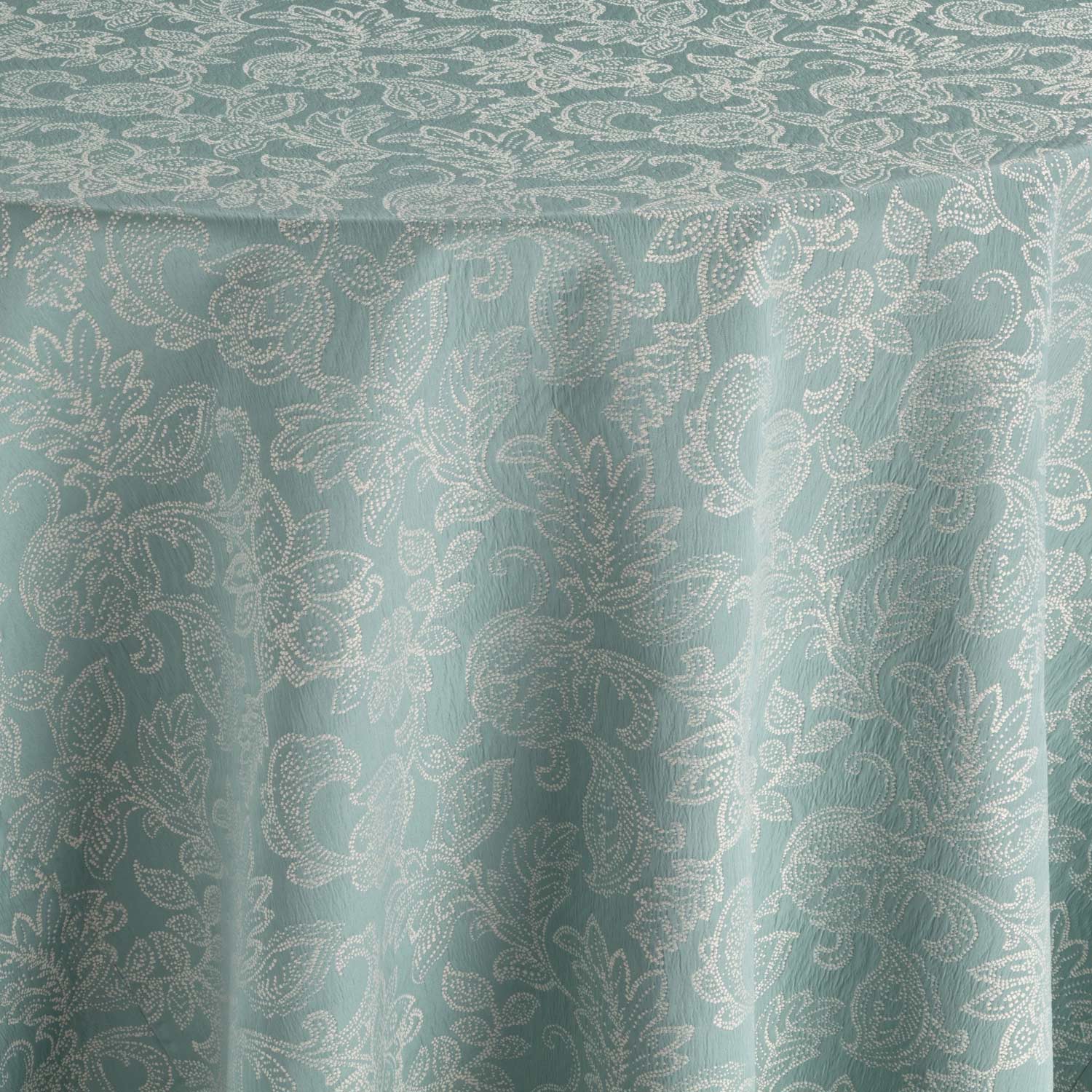
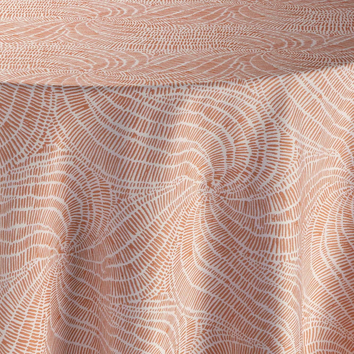
Pairing
Top Left: Cheng Real Estate Group | Top Right: Aislinn Kate Photography| Florals by the Sea | Carillon Weddings
Bottom Left: Aislinn Kate Photography| Florals by the Sea | Carillon Weddings | Bottom Right: The Happy House
A dynamic and vibrant color, Melon is refreshingly stunning when combined with Gossamer Green and white. Looking for depth? Combine Melon with navy blue for a toned-down yet versatile palette. Gossamer Green combines beautifully with lilacs and blues for a bright, clean effect. For a more low-key look, use Gossamer Green as a highlight color against monochromatic gray tones.
Looking for Inspiration


In Nature
Gossamer Green presents as a soft, restful seafoam blue-green evoking a relaxed mood of coastal living. In contrast, Melon reminds us of the tropical shades of the Caribbean and luscious seasonal fruits.
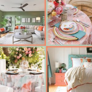
Interior
 Houzz | Laurel & Wolf | HGTV
Each of these colors can work as a stand-alone choice or combined. Gossamer Green is a friendly blue-green that can trigger creativity and a sense of freshness. It is the perfect color if you’re looking to create a welcoming front entry or a peaceful bedroom.
An instant conversation starter, Melon will add movement and energy to any room. This cheerful shade works well in kitchens, living rooms, or even laundry rooms. Unsure about painting, try adding Melon accents to revitalize any room instantly. Think pillows, throws, area rugs, curtains, or any other type of accent piece.
Fashion
 Vogue | Trend Spotter | Highs Nobiety | VJV Fashions | Style Caster
Gossamer Green falls in the green tonal bucket making it very adaptable and on-trend. Whether looking for all-over color or subtle pops in a more extensive palette. This hue can be found in a variety of textures, from silky satins to luxurious knits. Melon combines the warmth of Pantone’s 2019 Color of the Year, Living Coral with the delicacy of pink, making it a color full of options. Looking to make a bold statement? Go head-to-toe in Melon. For those more color shy, opt for a statement piece such as a pair of sunglasses or a bold piece of jewelry.
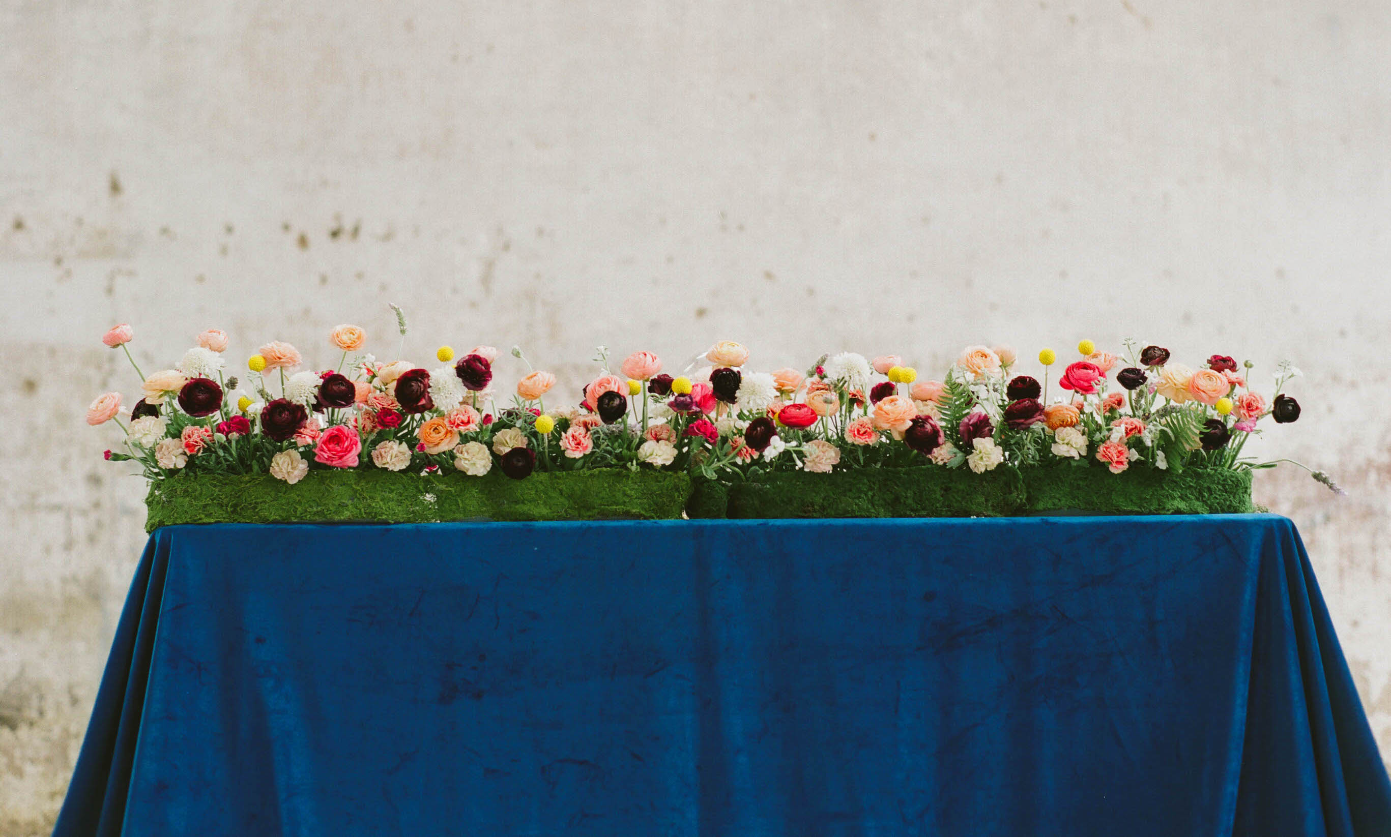
Event Design
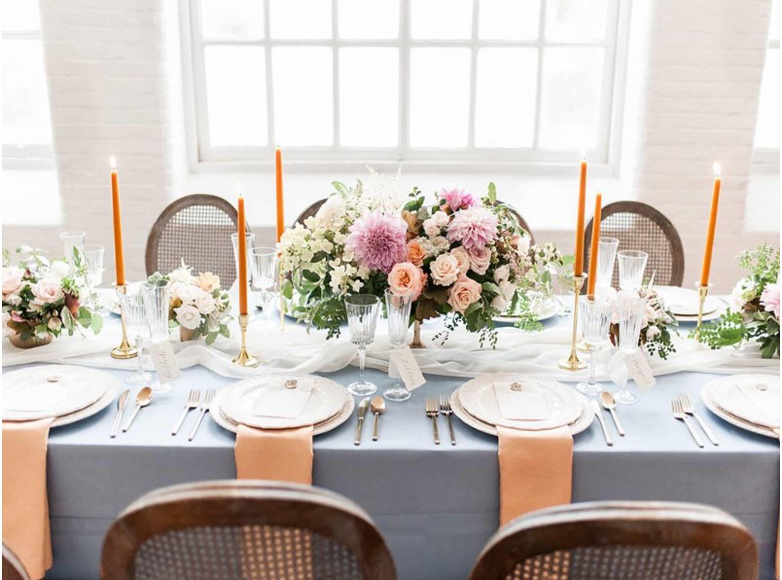
Top: Charla Storey Photography | The Southern Table | The Adolphus Hotel
Bottom: Madcap Cottage | Theo Milo Photography | Curtis Kennedy Films | Out Of The Garden | Ohh! EventsRyan Designs
Whether you want to capture the essence of spring or are looking ahead for great summer trends, our color crushes will help you create an unforgettable event. Check out our Pinterest for inspiration and the latest trends. We know you have many more creative ideas, so tag @BBJLinen on Instagram using #FebruaryColorCrush to show us how you’ll use this month’s Color Crush. For more of our Color Crushes, check out our previous Color Crush blog posts.
Shop this look